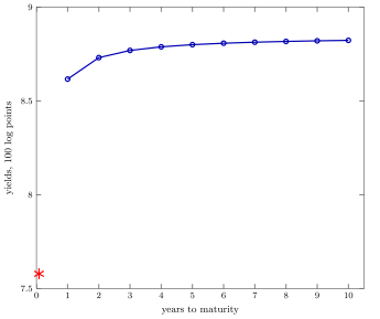
Average yield curve for the benchmark model. The star point on the left is the average yield on a one-month zero coupon bond, \(12 \mathbb{E}\left[\log(R_f)\right]\). Note that, because the risk free rate is so volatile and because \(\log(\cdot)\) is concave, this yield turns out to be about 1% lower than the average risk free rate (\(R_f=8.19\%\) annual) reported in the main text.
In the paper: Figure III. Average yield curve (annualized).